ITN —
Case study
— Positioning
— Architecture
— Strapline
— Story
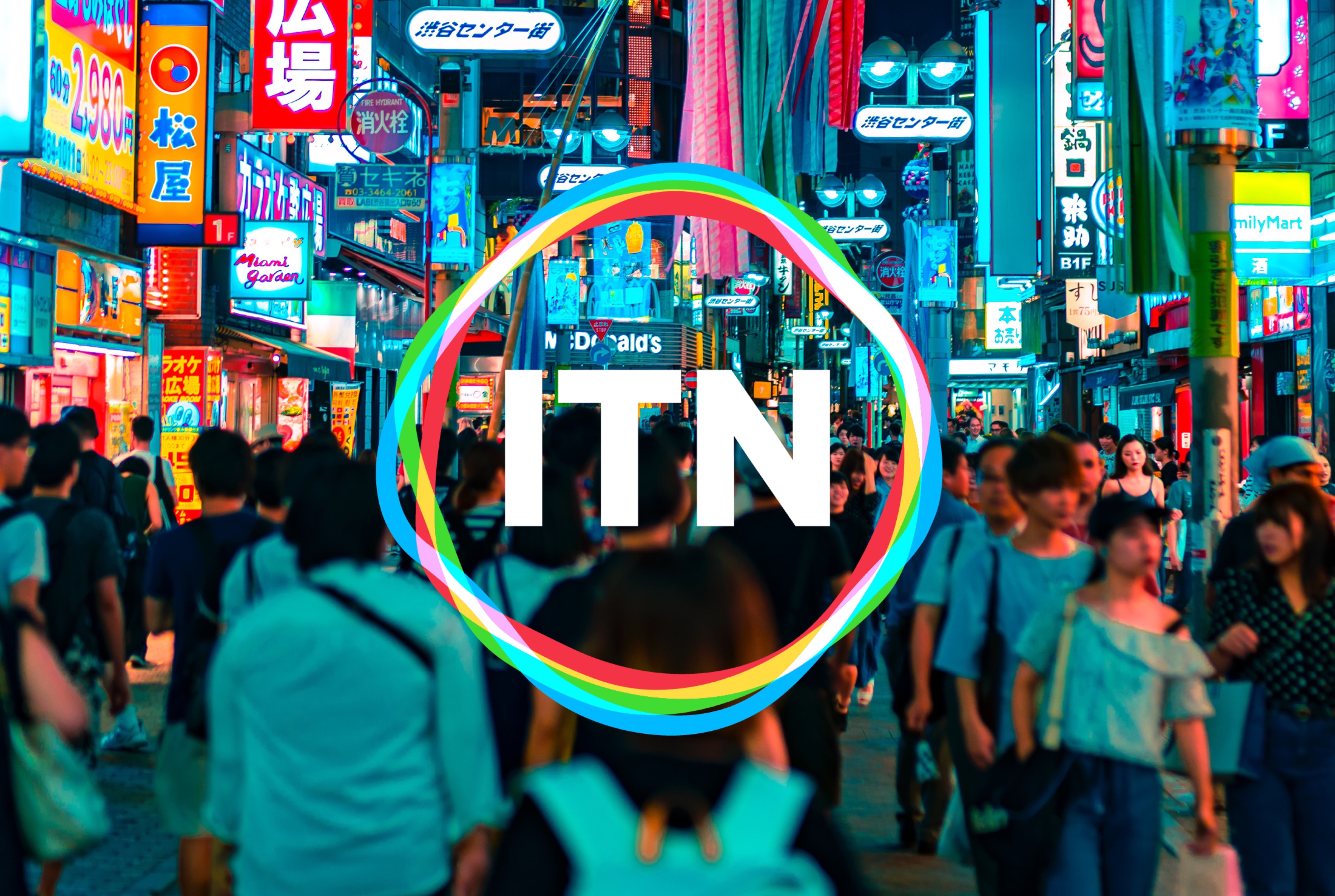
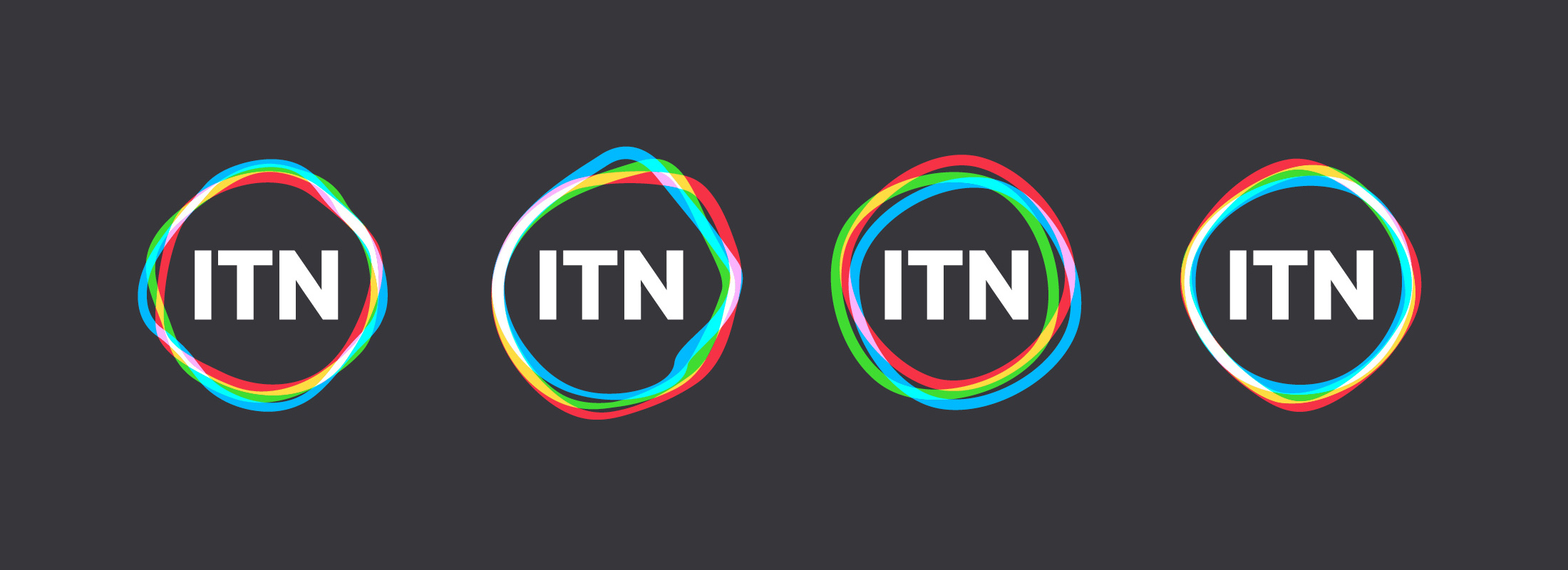
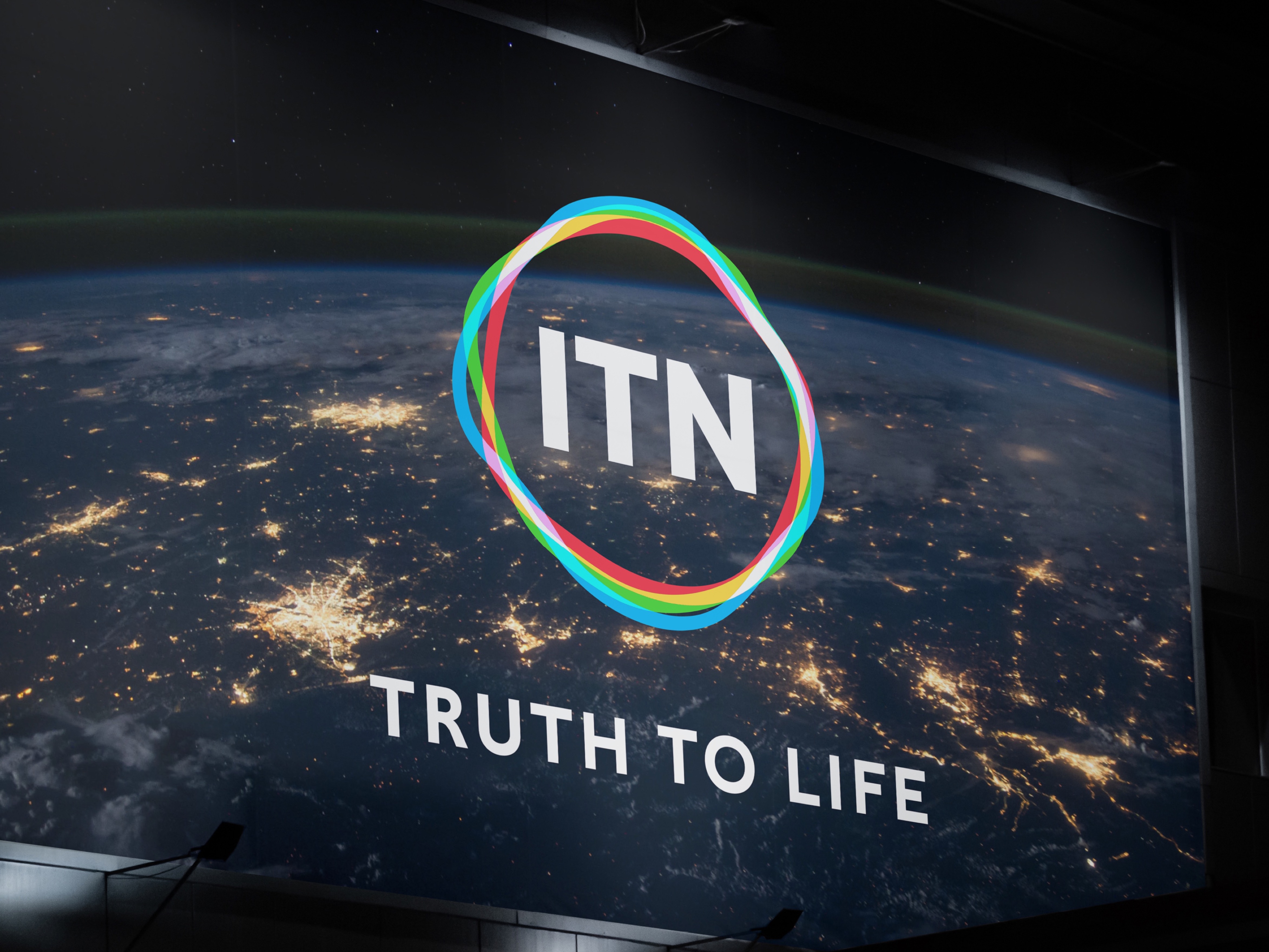
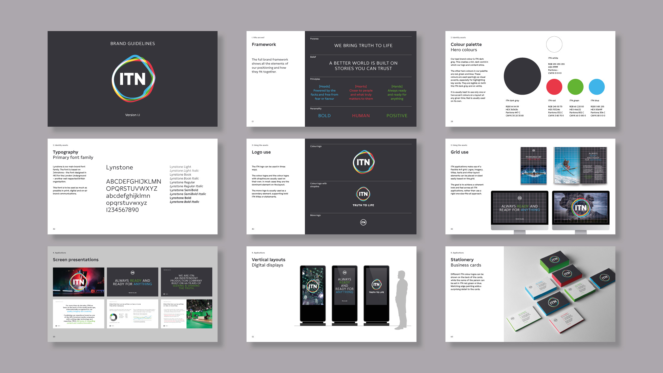
— Visual identity
From broadcast news to the future of factual
Working in partnership with Rudd Studio, we created a new positioning and visual identity for ITN – their first major rebrand since 1970.
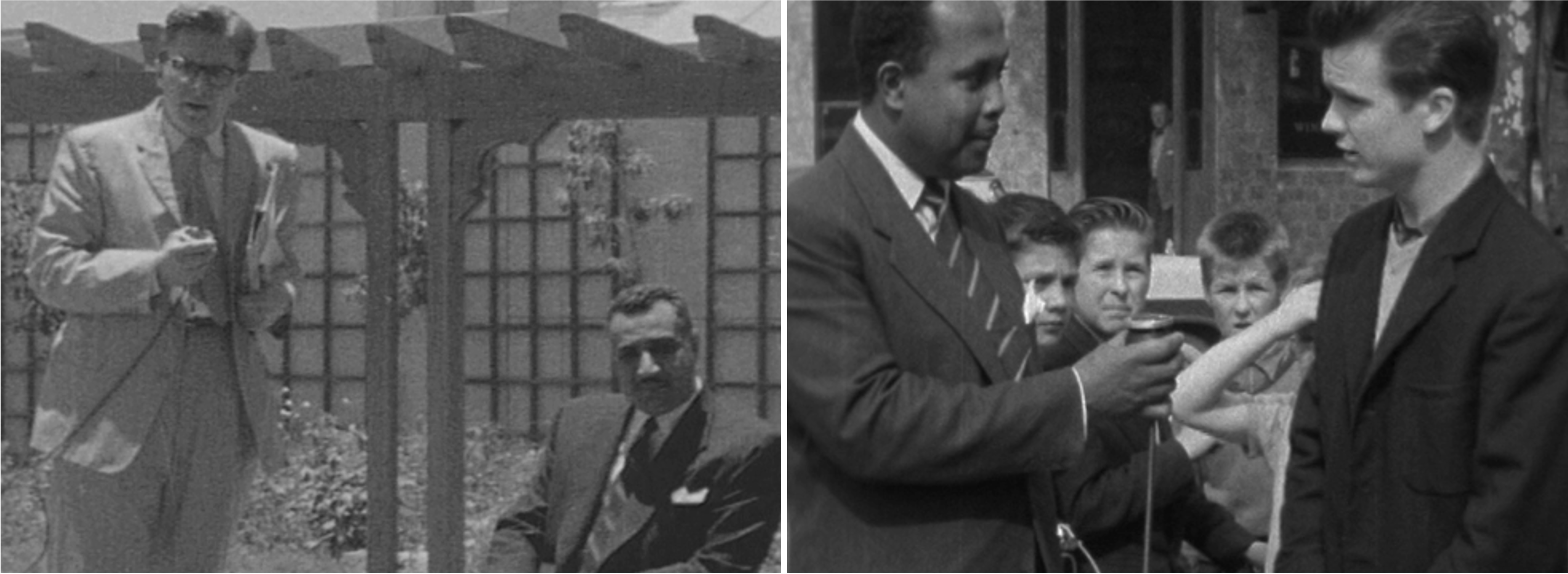
65 years at the heart of our national story
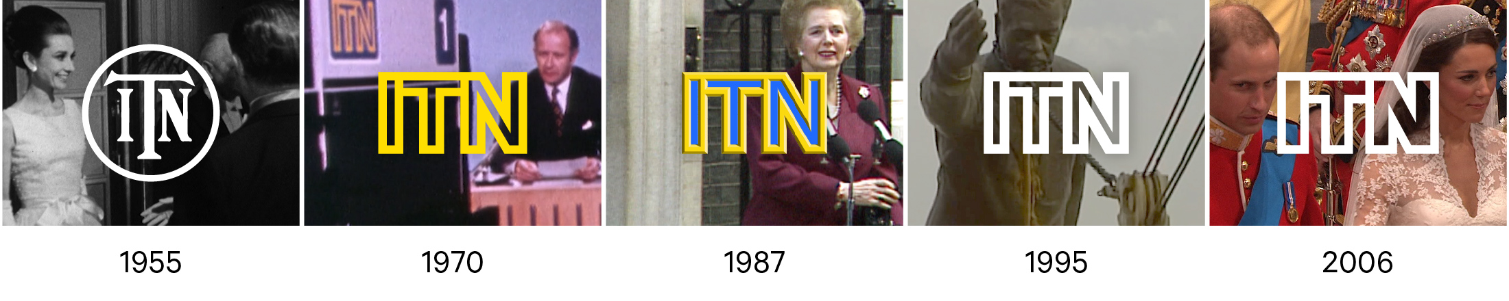
ITN has been central to Britain’s political and cultural life since 1955, broadcasting daily news and current affairs shows across the ITV network, Channel 4 and Channel 5. Always embodying the highest public service standards of accuracy and independence, ITN also earned a reputation for innovation and audience engagement, pioneering much of the world of news we know today – with the first live newscasters, the first women reporters and presenters and the first warzone coverage.
The opportunity
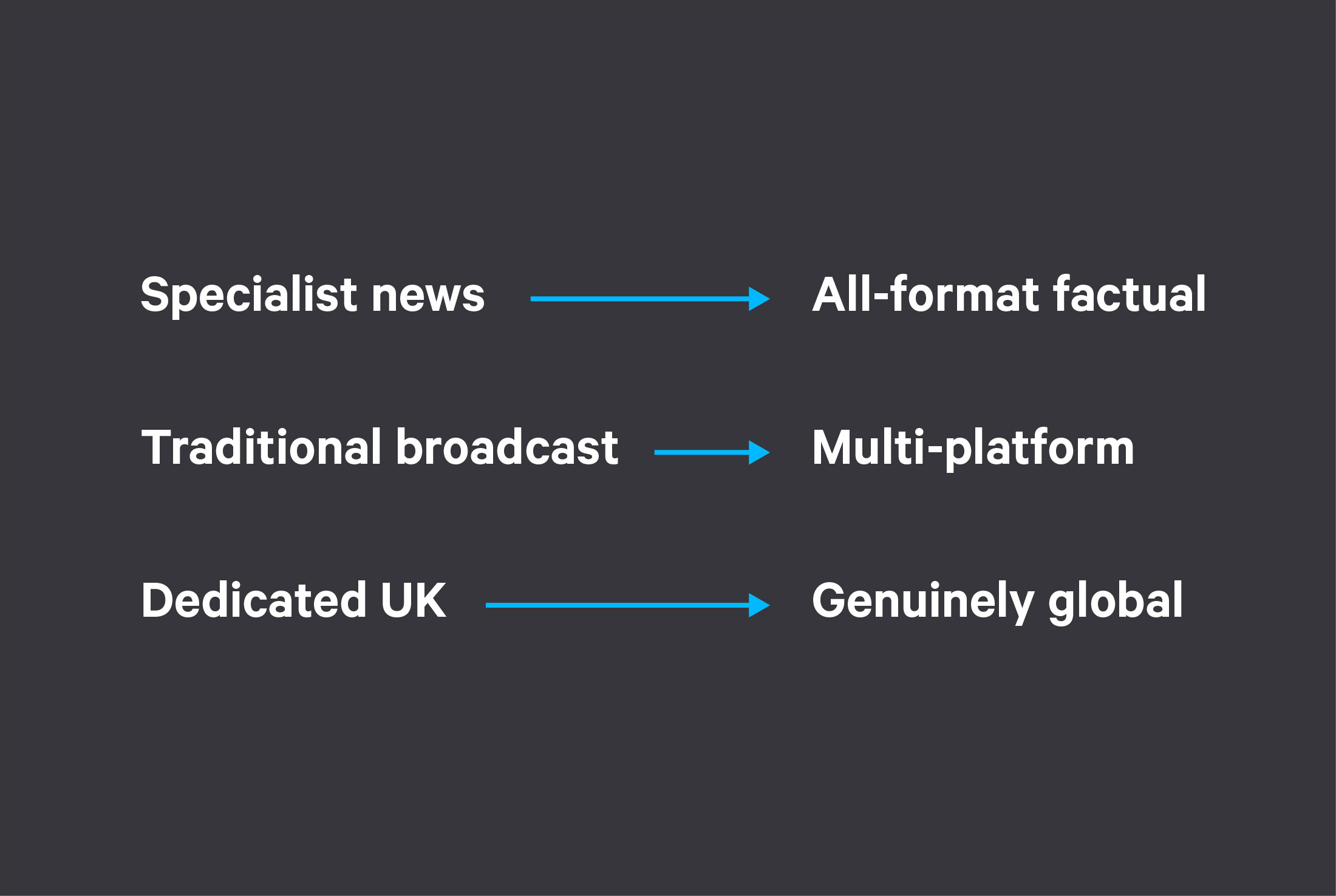
Today, ITN is building on its reputation for impartiality and innovation in news and current affairs and expanding its offering into documentaries, sport, short-form and branded content. The ambition is to broaden ITN’s reach and range, to embrace the explosion of new routes to market across global streaming services and help shape the future of factual.
This strategy calls for three shifts in business culture and market positioning: from specialist news to all-format factual, from traditional broadcast to multi-platform, from dedicated UK to genuinely global.
Updating an icon
The old ITN brand, with its famous linked letter forms, had been in place since 1970, with only minor changes over the years, making it one of the longest standing brands in UK broadcasting and something of a cultural icon. For all its solidity and power, research showed that the brand was locked in the past and too closely associated with ITN’s news output.
The time was right to make a change and, together with our partners at Rudd Studio, we were brought onboard to create a new positioning and visual identity to signal ITN’s ambition.
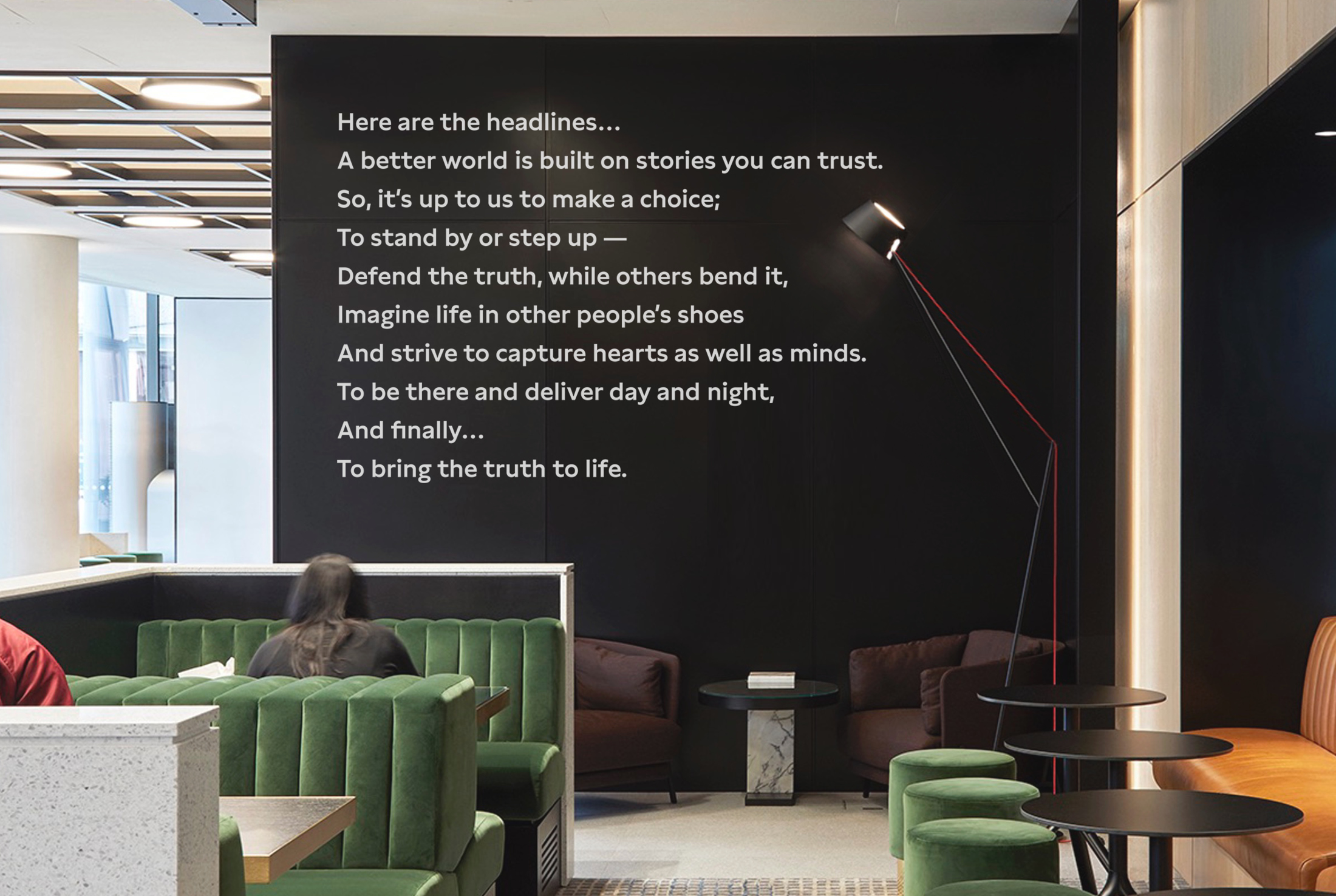
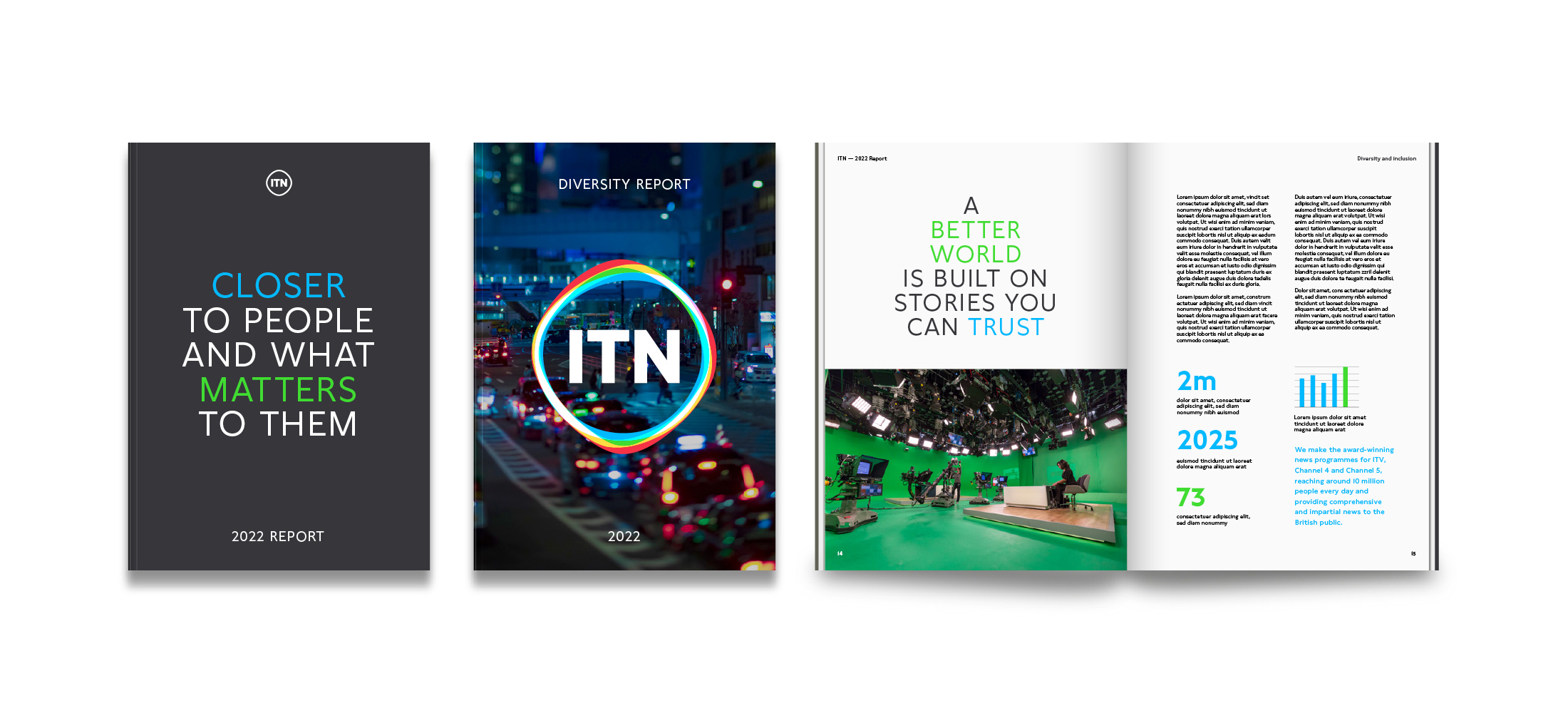
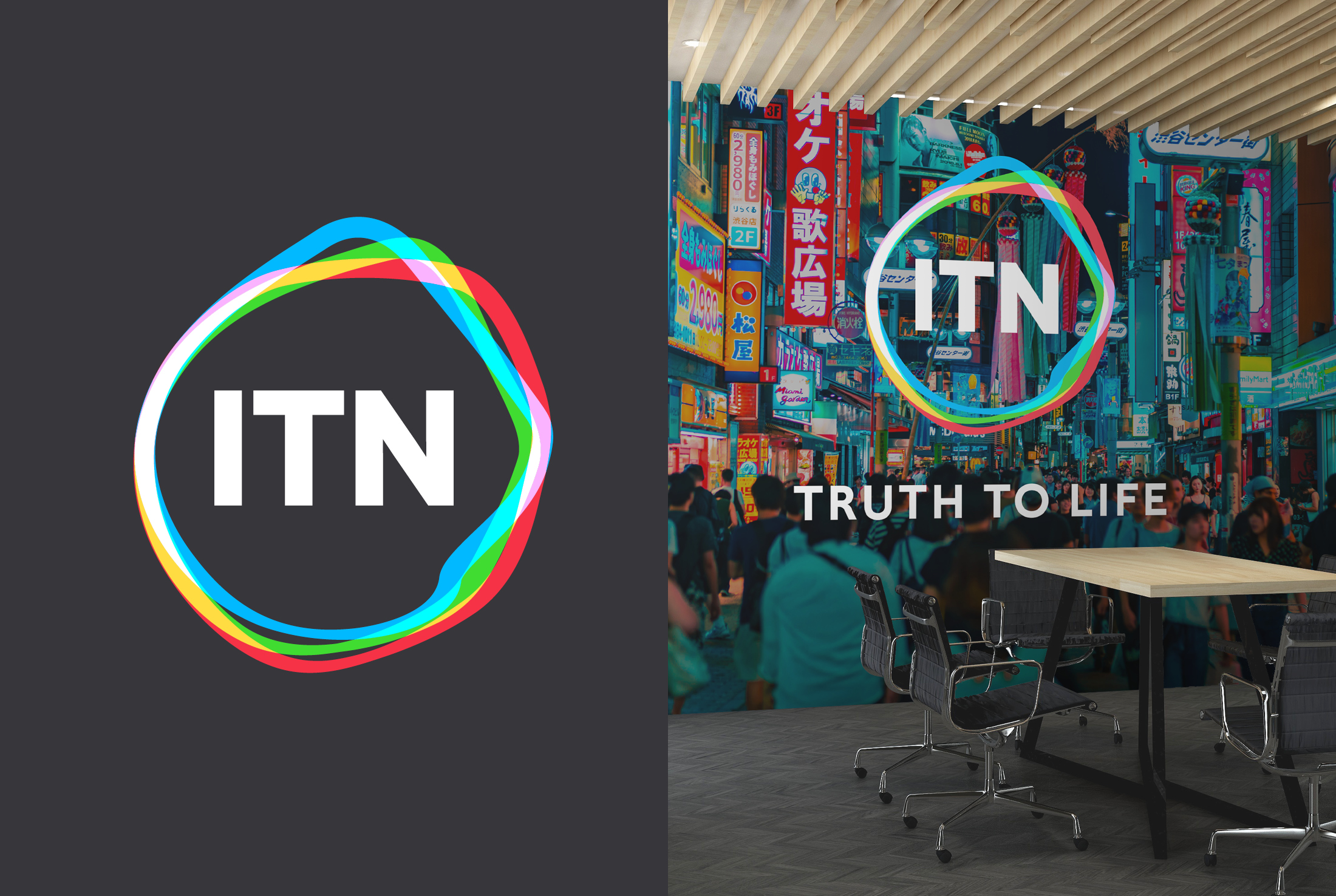
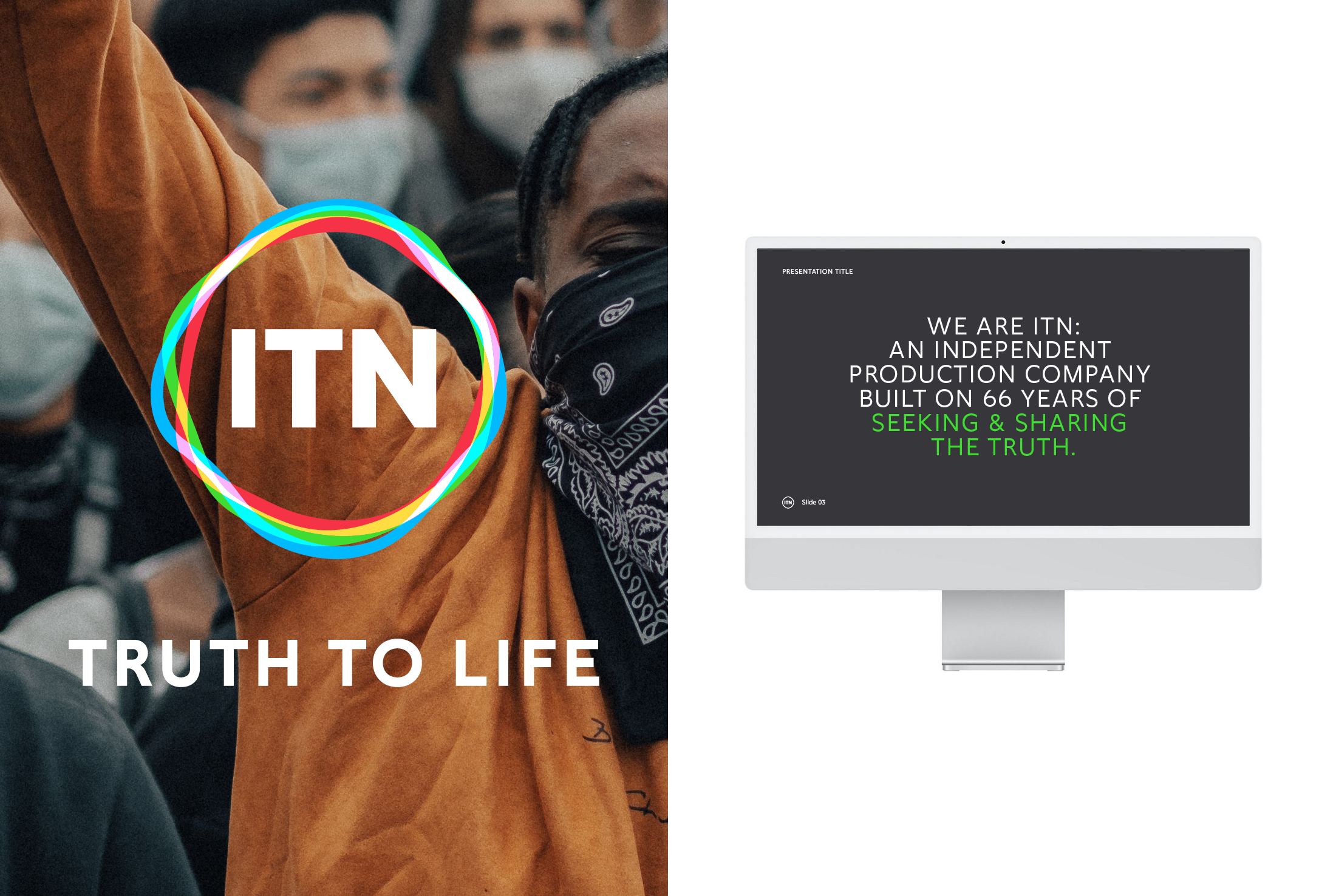
Bringing truth to life
Working with leaders, employees and customers, we created a new brand positioning built around the purpose statement and strapline – “Truth to Life” – to signal ITN’s shift from pure news to all format factual and emphasise their ability to tell true stories with more emotional intelligence and impact. We knew this mission to bring the truth to life had the power to unite all parts of the organisation around a compelling and differentiating commercial proposition. At the same time, it would also underpin ITN’s determination to be a force for good in the world.